Category: SERVICES

Micro Screening in Offset Printing – Because Details Matter

Micro Screening – Because Details Matter

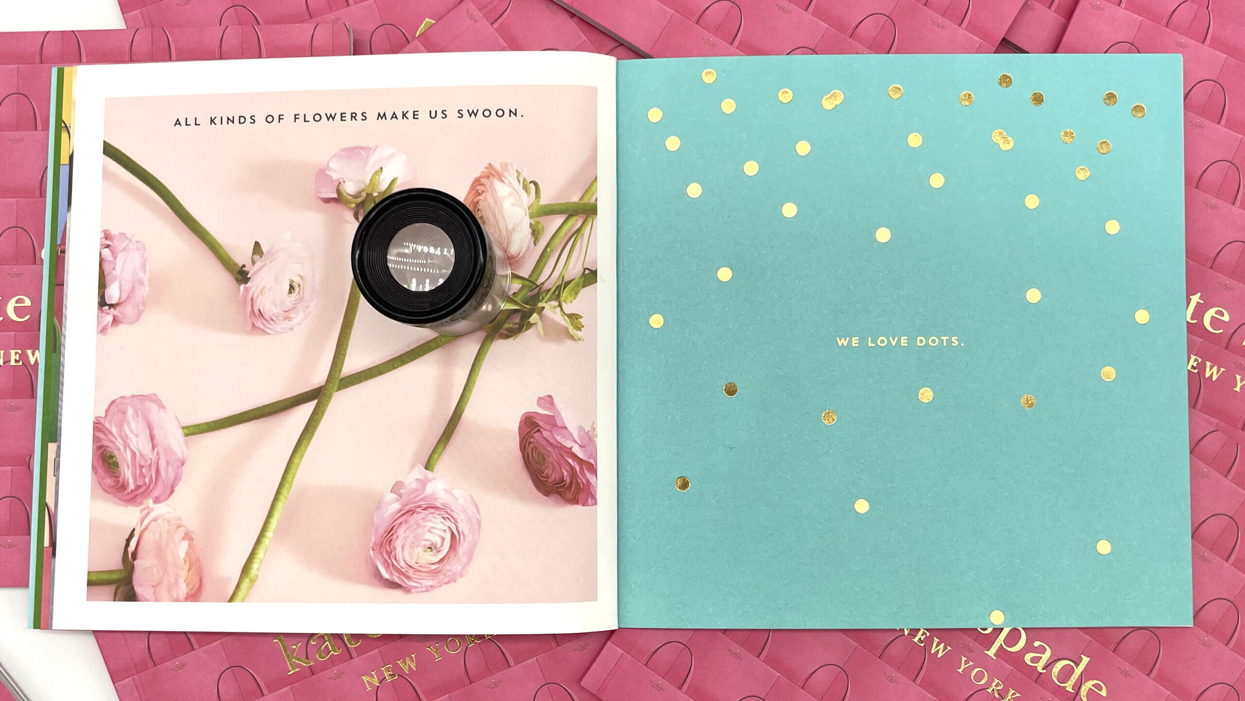
In the world of print, achieving exceptional image quality is crucial. Whether crafting captivating photographs, intricate graphics, or vibrant materials, the ability to capture fine details and reproduce colors accurately is essential. Enter micro screening, a powerful technique revolutionizing print quality.

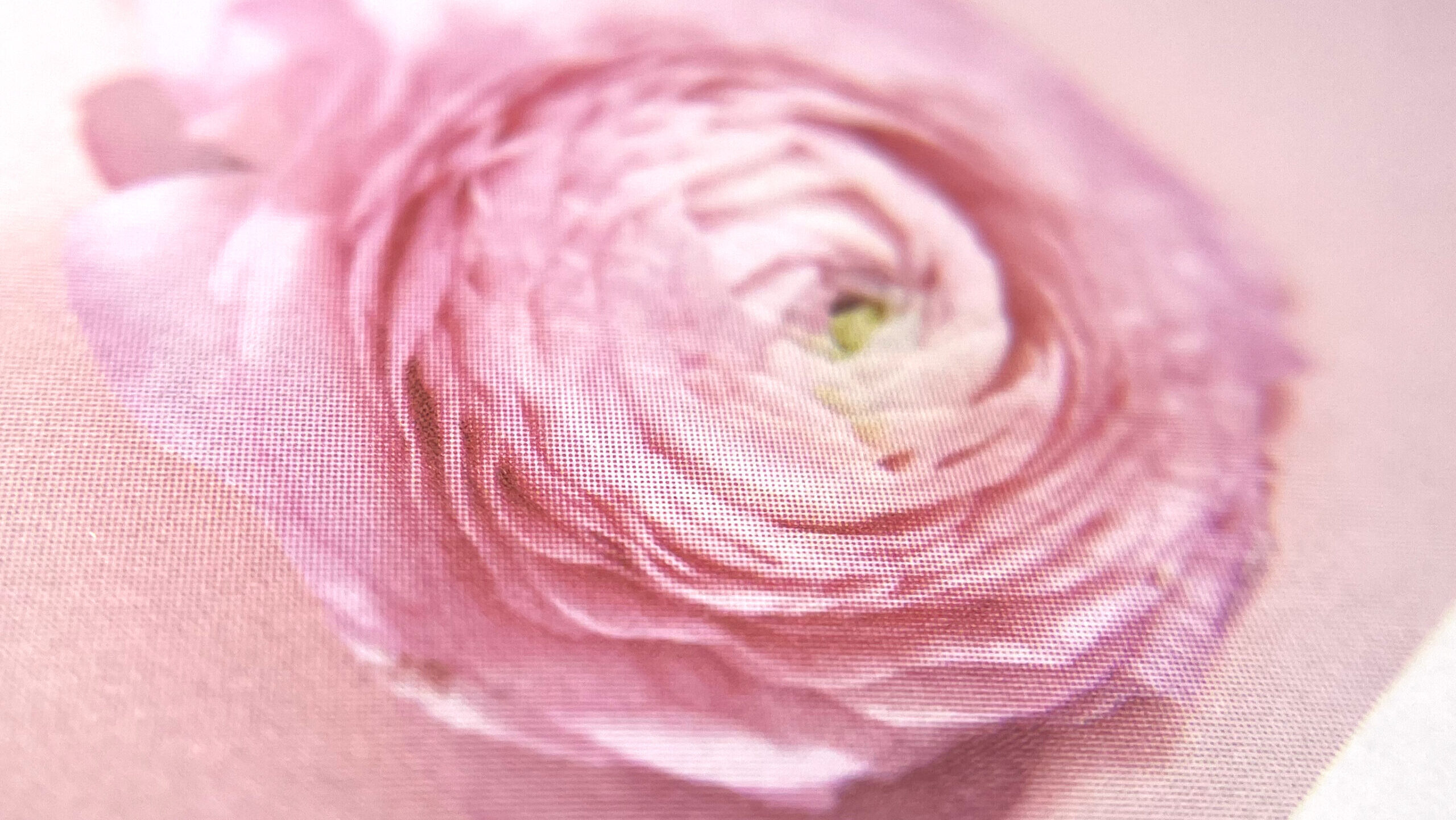
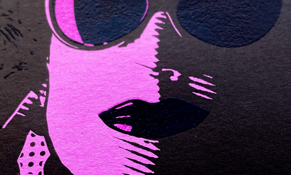
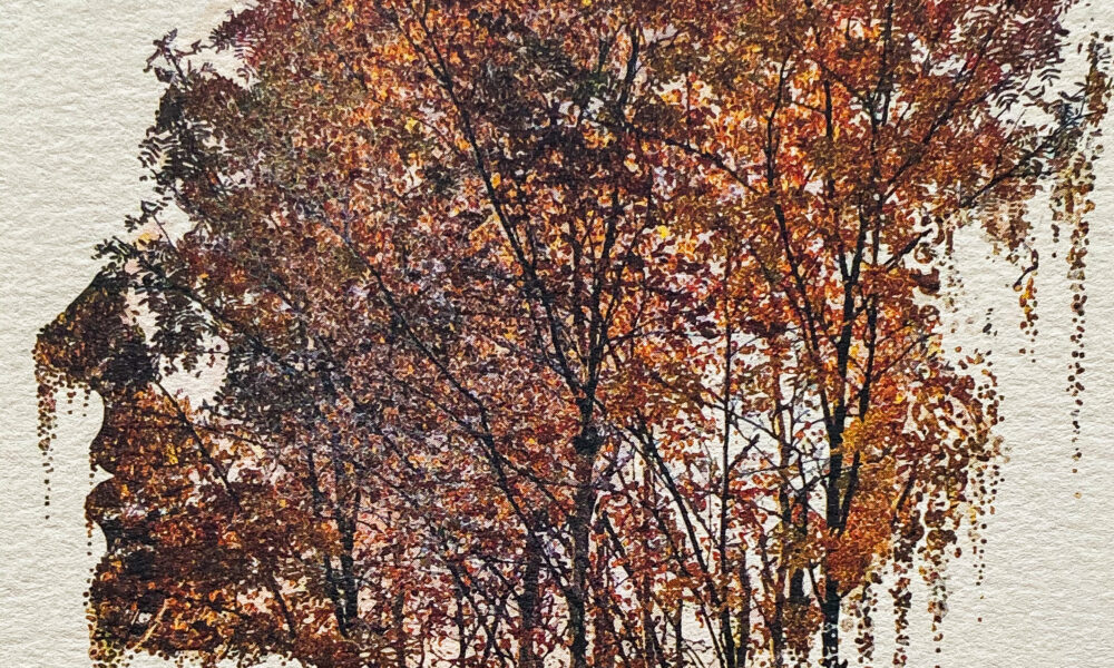
Micro screening breaks down images into minuscule dots or pixels, precisely arranged to create smooth gradients, fine details, and accurate colors. This meticulous process ensures sharp, vibrant, true-to-life prints.

Unlike traditional screening methods, which rely on larger dots and coarser patterns, micro screening utilizes much smaller dots and finer patterns, allowing for greater detail and resolution. By leveraging advanced algorithms and software, micro screening optimizes dot placement, smoothing transitions between colors and minimizing unwanted artifacts like moiré patterns.

The Benefits of Micro Screening:
Superior Image Quality

Micro screening enables the reproduction of images with exceptional clarity, sharpness, and detail, elevating the overall quality of printed materials.

Enhanced Color Accuracy

With micro screening, colors are reproduced with remarkable accuracy, ensuring that prints faithfully capture the nuances and subtleties of the original artwork or design.

Reduced Moiré Patterns

Micro screening helps minimize the occurrence of moiré patterns, those unwanted interference patterns that can detract from the quality of printed images, resulting in cleaner and more professional-looking prints.

Increased Print Resolution

By utilizing smaller dots and finer patterns, micro screening allows for higher print resolutions, making it possible to reproduce fine text, intricate graphics, and high-quality photographs with unparalleled clarity and precision.

Versatility and Flexibility

Micro screening is compatible with a wide range of printing substrates and ink types, offering printers greater flexibility in meeting diverse printing requirements and delivering exceptional results across various applications.

Types of Screens

Click each image to for more detail. 

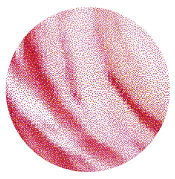
Stochastic Micro Screen:

Stochastic screening, also known as FM (frequency modulation) screening, utilizes random dot patterns of varying sizes instead of traditional halftone dots. These dots are dispersed evenly across the image, creating a more natural and continuous gradient.

  • Advantages:
    • Improved image quality: Stochastic screens produce smoother gradients and finer details compared to traditional halftone screens, resulting in higher-quality prints.
    • Minimized moiré patterns: By eliminating regular dot patterns, stochastic screens reduce the occurrence of moiré patterns, especially in high-frequency areas.
    • Increased color fidelity: Stochastic screening allows for better color control and accuracy, leading to more vibrant and lifelike prints.

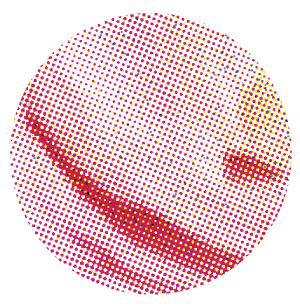
Hybrid Standard Micro Screen:

Hybrid screening combines traditional halftone dots with stochastic dots in specific areas of the image. This approach combines the benefits of both screening methods to optimize print quality.

  • Advantages:
    • Enhanced detail rendition: Hybrid screening preserves fine details while minimizing the risk of moiré patterns, striking a balance between image quality and consistency.
    • Versatility: Hybrid screening allows printers to adapt dot patterns based on the requirements of different images, providing flexibility in achieving optimal results across various print jobs.
    • Improved efficiency: By selectively applying stochastic dots where needed, hybrid screening can optimize ink usage and reduce printing time without sacrificing quality.

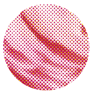
Standard Micro Screen:

Standard screening, also known as conventional halftone screening, employs regular dot patterns of fixed size and spacing. These dots vary in size to reproduce different tones and shades in the printed image.

  • Advantages:
    • Cost-effectiveness: Standard screening is a cost-efficient option for most print jobs, as it requires less processing time and resources compared to stochastic or hybrid screening methods.
    • Wide compatibility: Standard screens are widely supported by printing equipment and software, making them accessible and easy to implement for printers of all sizes.
    • Predictable results: With well-established parameters and workflows, standard screening delivers consistent and predictable print results, making it a reliable choice for many commercial printing applications.

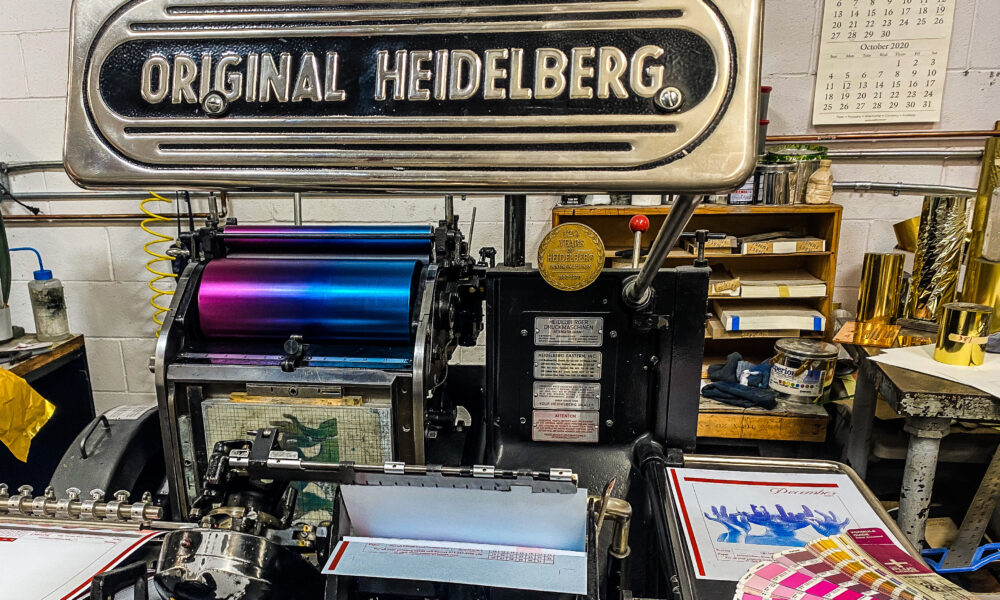
Leveraging our Heidelberg SX74 offset printing press, which combines micro screening precision with advanced capabilities, we deliver superior print quality. Whether utilizing stochastic screening for smoother gradients or traditional halftone screening for reliable results, our printing solutions are crafted to meet the highest standards of quality and precision.

GET IN TOUCH

Trust us to bring your vision to life with stunning clarity and precision, exceeding expectations in every project.

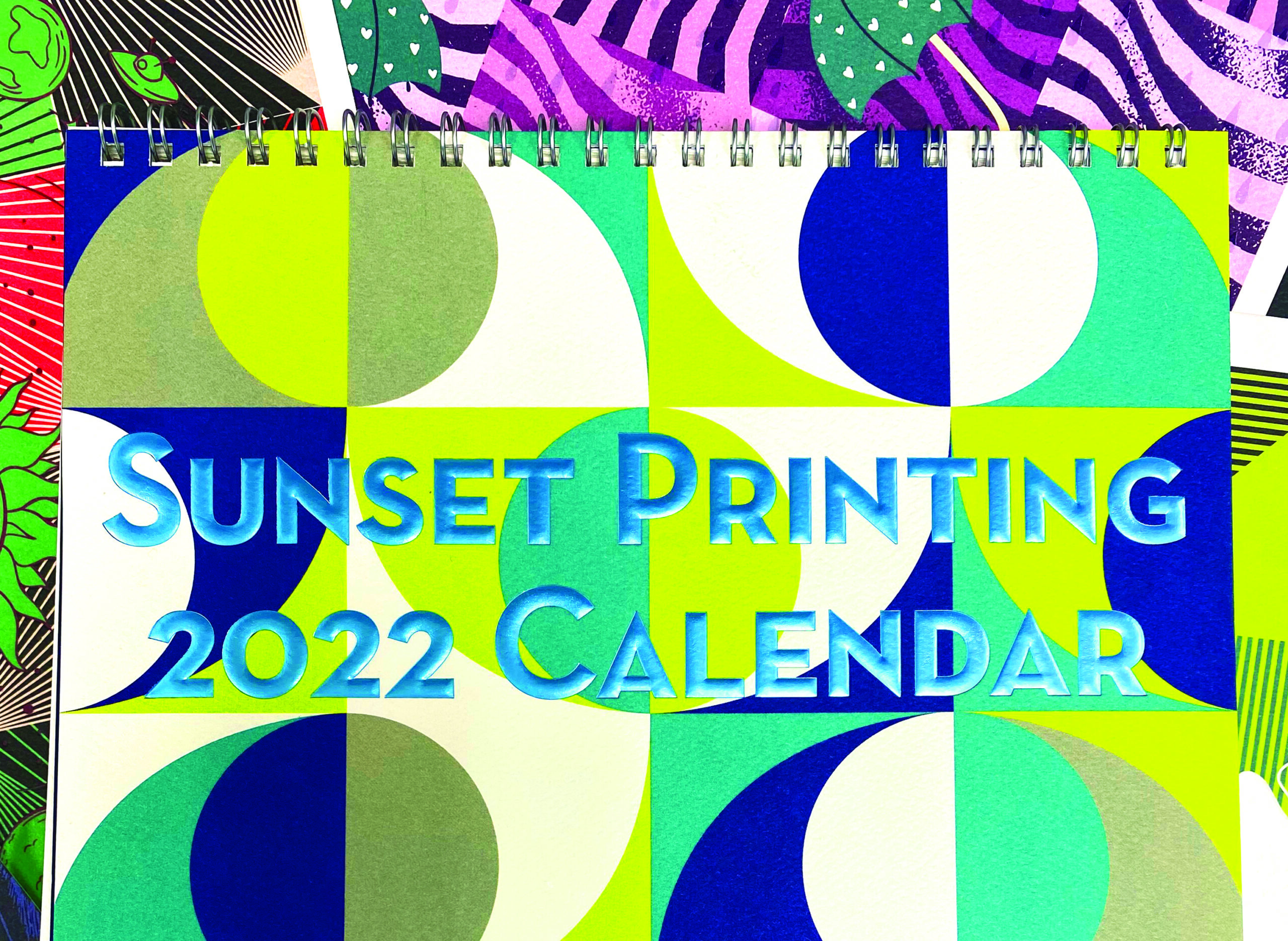
2022 Calendar Contest!

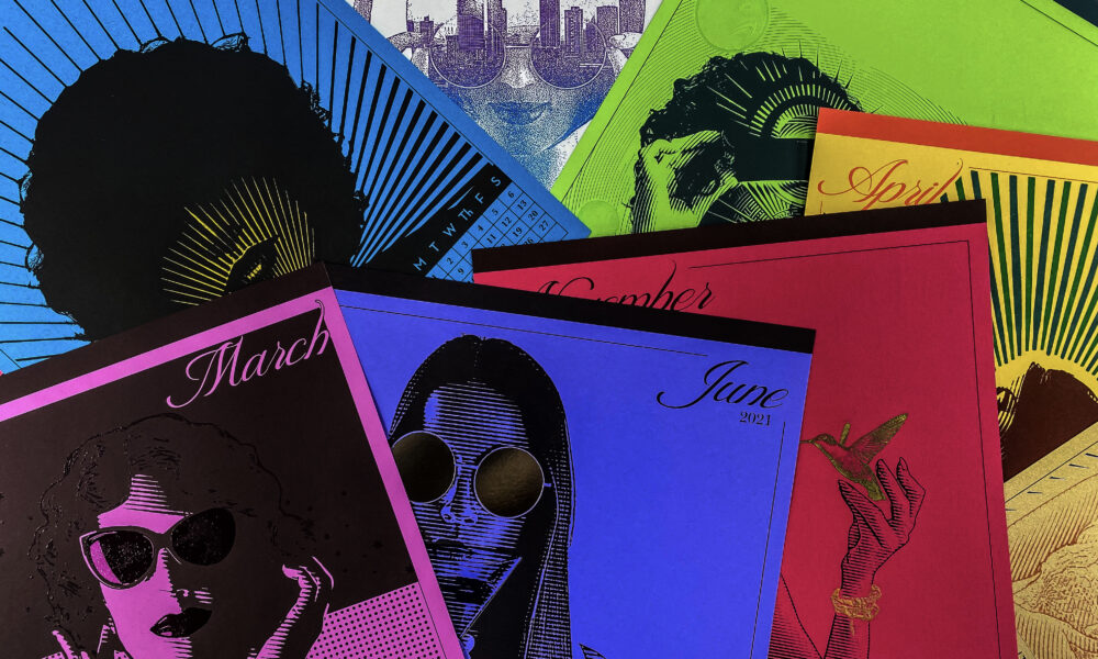
Our team of craftsmen and women have worked hard all year, designing, planning and producing our 2022 calendar to showcase the many ways that we make print exciting. Letterpress, Intaglio, Foil Stamping, Digital and Offset Ink, Thermography and beautiful design are what we love doing here at Sunset.

To add to the fun of this calendar, we have created a hidden message within it.
By finding the hidden single letter in each month and figuring out the message
you can enter our contest to win an iPad!

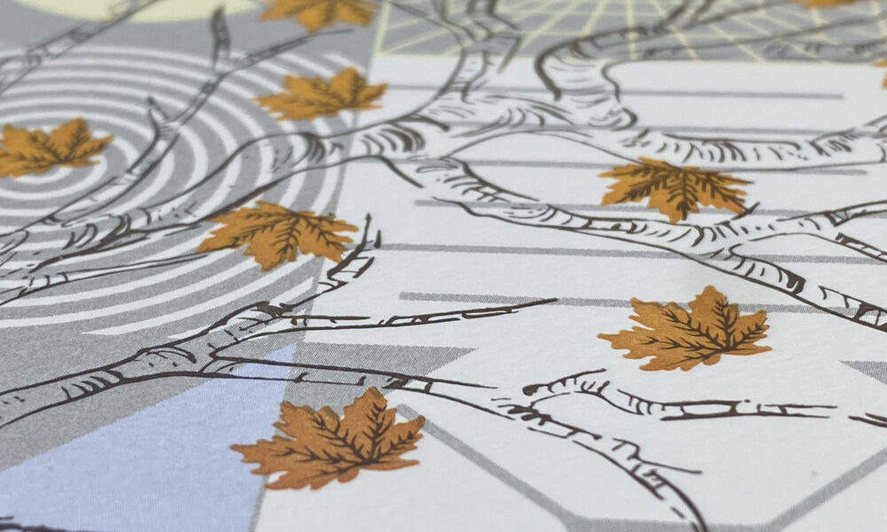
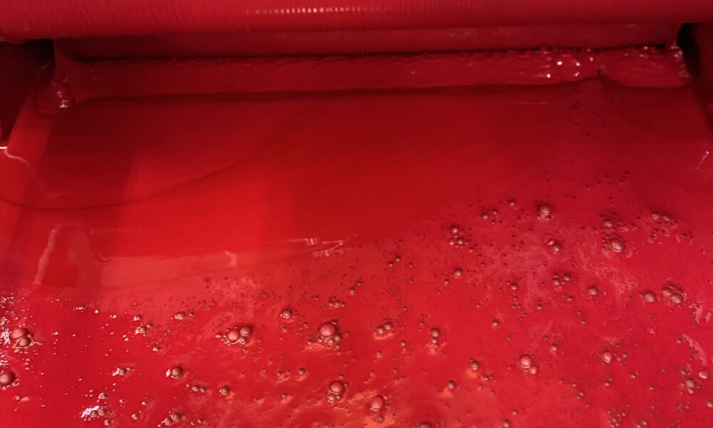
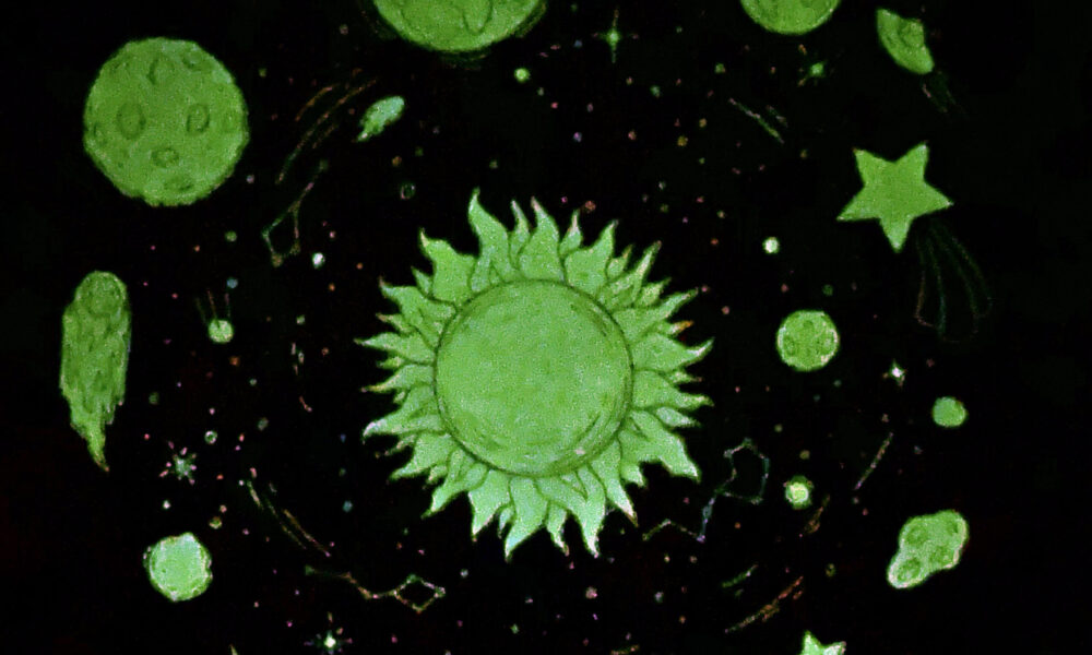
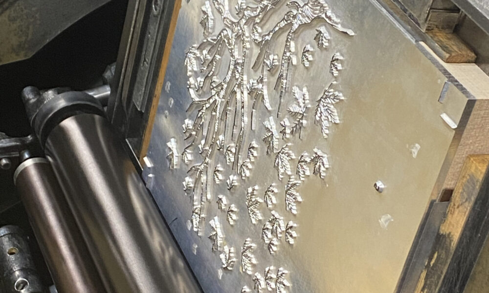
As with every year, we combine the minds at Sunset and bring new perspective to the processes we use every day. This year with our  Letterpress processes, we over printed leaves already printed using a split fountain technique for November. For August we took UV ink and created a glow in the dark effect that is out of this world.

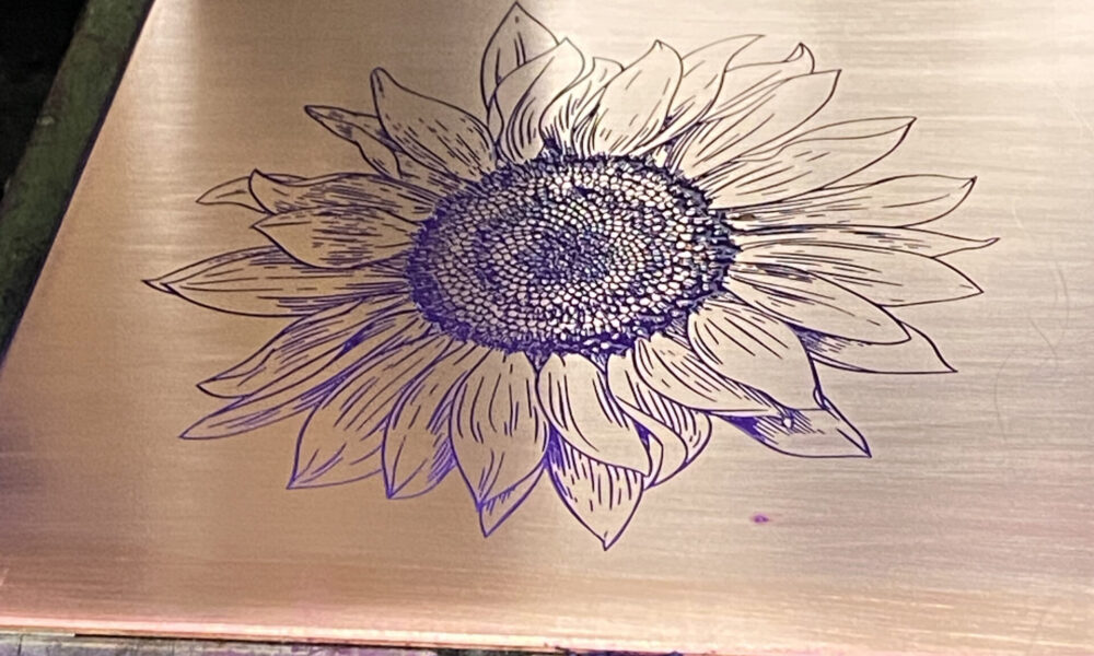
Our Intaglio months highlight just how lucky we are to be able let our imaginations take over and get creative while mixing inks on press to help enhance our design.

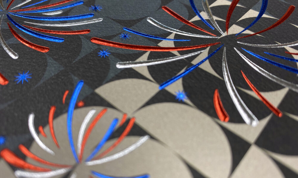
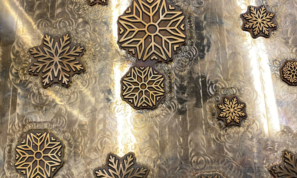
The Foil Stamping designs included in this year were something we took our time to evaluate, both before press and once our stamping dies were up to temperature. The simplicity of blind embossing vs registered embossing is a process we love to showcase.

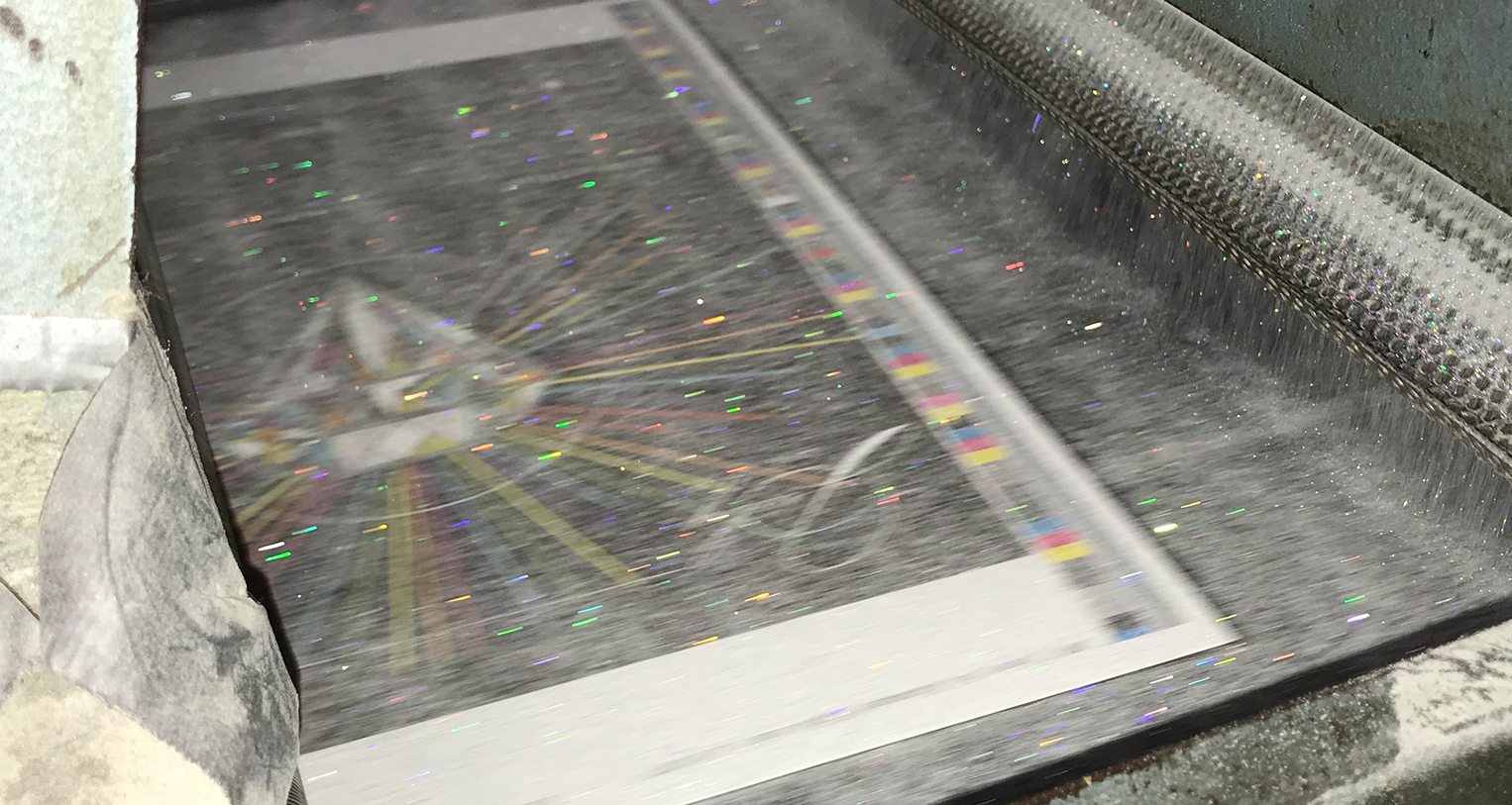
Thermography is always something that we enjoy sharing with the design community on how to properly utilize as an embellishment. With the ability to use glitter to highlight October, it was spooky in the best way!

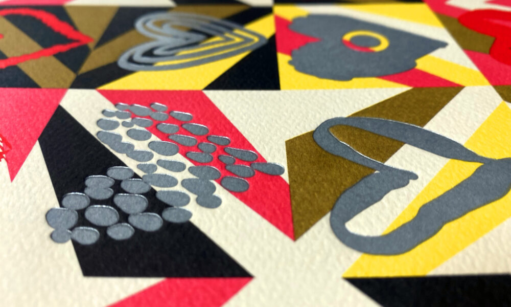
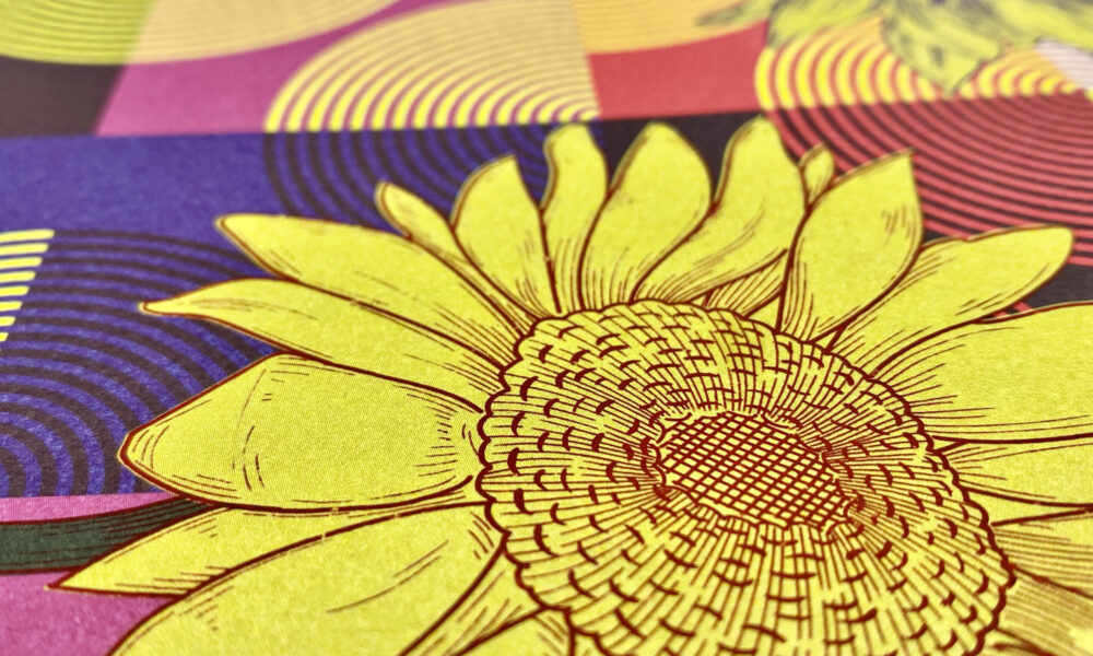
We have both Offset and Digital printed pages included in our calendar. With the addition of our new HP Indigo 5650 press with White Ink capability, a whole new world of printing was opened to us. We are now able to lay down multiple hits of white on dark stocks and print white under CMYK allowing us to create vibrant images on any color stock that we like.

If you would like your desk to become more colorful please Call or Email and we will send you your very own calendar to enjoy!

Enter to win our 2021 Calendar!

Our team of craftsmen and women have worked hard all year, designing, planning and producing our 2021 calendar to showcase the many ways that we make print exciting. Letterpress, Intaglio, Foil Stamping, Digital and Offset Ink, Thermography and  beautiful design are what we love doing here at Sunset. You can enter to win a calendar for you and a friend so you both have 365 days of color!

Our 2021 Calendar is Now Available!

After a year filled with all of the insanity that was 2020, we are more excited than ever to turn the corner!

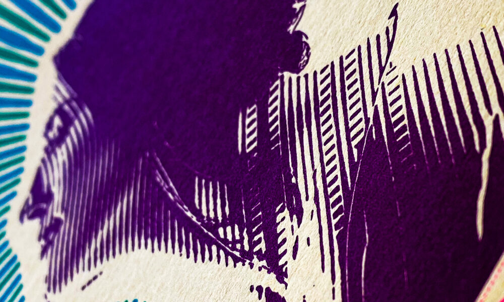
We worked hard to create simple images that transform into beautiful works by the many print processes that we use here at Sunset. The end result is something special that we can enjoy every day of 2021.

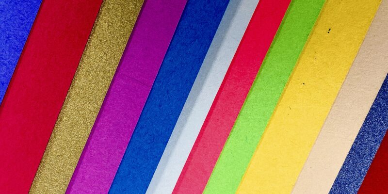
This year’s Sunset calendar is the first time in 10 years that we have utilized colored paper stocks for our calendar. This was a challenge that we welcomed to showcase both the beauty of various paper stocks as well as the many ways we can print on colored stocks to enhance their inherent elegance. Between our friends at Mohawk with Keaykolour papers and our friends at Neenah with Astrobrights® papers, we had a hard time narrowing down which colors to run wild with.

83E43642-6B68-4E80-8F68-04E300759E2A

What we loved about the colored paper stocks was the way it bought new perspective to the processes we use every day. Considering Letterpress, on stocks other than white, added a new element to color theory, we had to reinvent the wheel and really challenge our creativity!

Some of the original ink chosen for Intaglio just didn’t pack the punch we were looking for, so again we let our imaginations take over and got creative while mixing inks on press to help enhance our design.

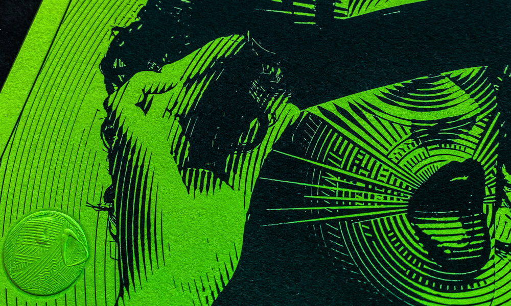
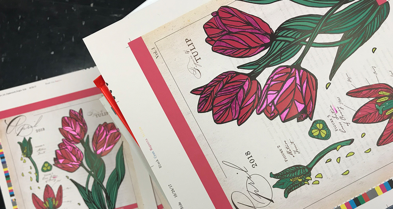
The Foil Stamping designs included in this year were something we took our time to evaluate, both before press and once our stamping dies were up to temperature. Foils can give you opaque and translucent effects and the use of holographic foil on a detailed offset ink print did something beyond our expectations.

Thermography is always something that we strive to show the design community how to properly utilize as an embellishment.  We used Matte Thermography and Gloss Thermography on the same month both in black over black ink, highlighting different effects within the same tonal range. A lot of these designs are things we’ve never done before and we see as our opportunity to experiment and share with you the results. Some of it doesn’t work and some of it exceed expectations.

We have both Offset and Digital pages included in our calendar and we needed to think outside the box when it came to expectations and reality. Some of the darker stocks we used had us questioning what could be done. With the addition of our new HP Indigo 5650 press with White Ink capability, a whole new world of printing was opened to us. We are now able to lay down multiple hits of white on dark stocks and print white under CMYK allowing us to create vibrant images on any color stock that we like.

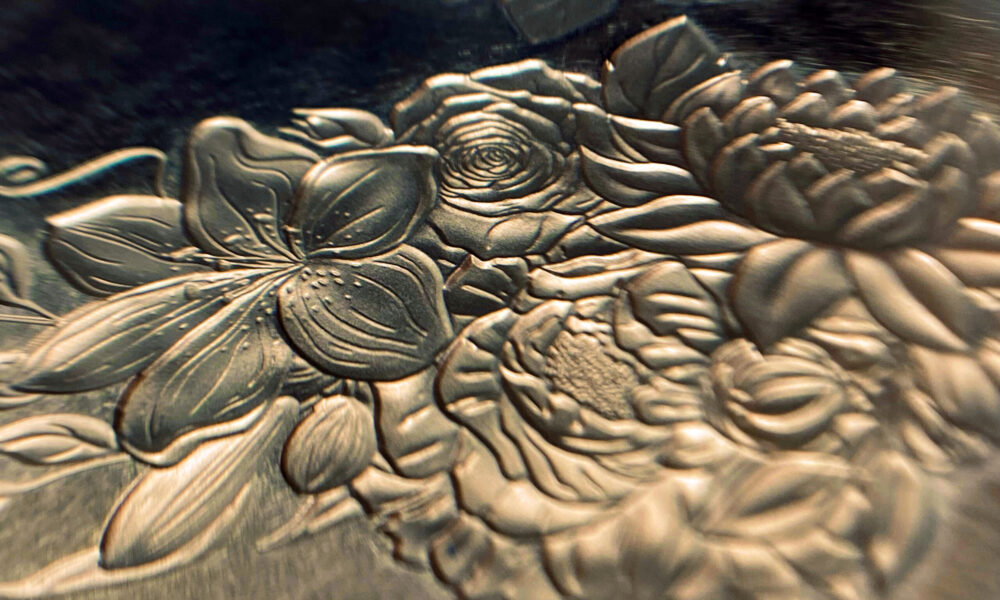
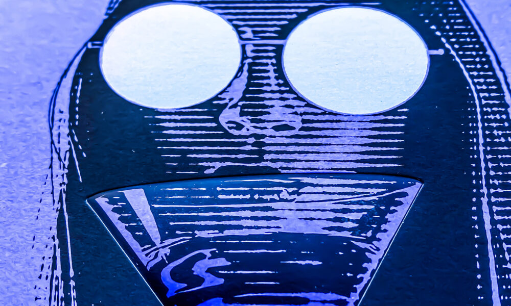
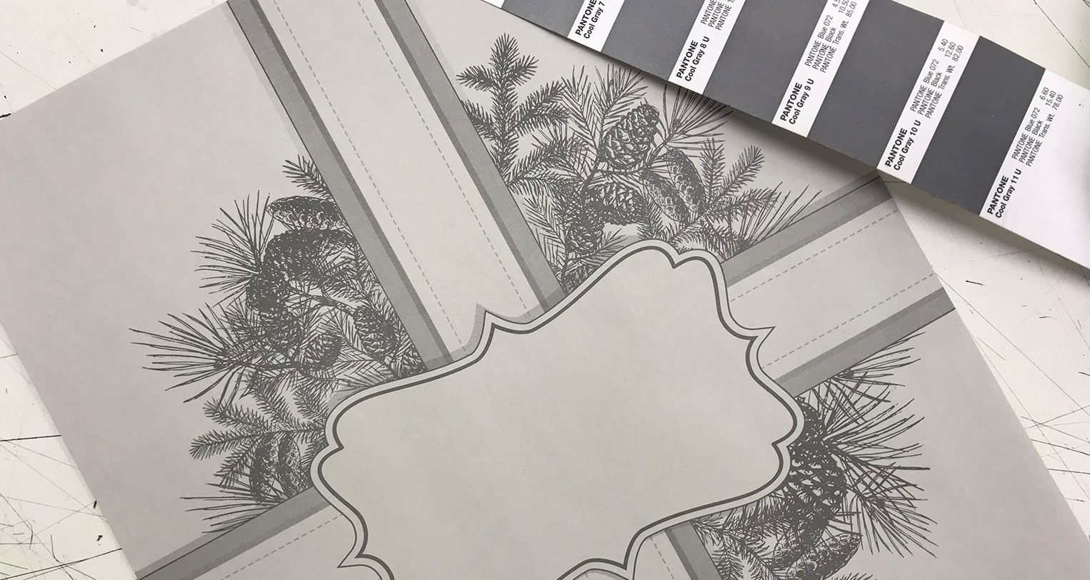
For our cover, we wanted to feature every specialty process we do here but within the realm of metallic silver. We have Intaglio, Letterpress, Thermography, Foil Stamping, Embossed Foil Stamping, and Offset printing. Every different process had one thing in common, we wanted to show different techniques to highlight the varieties in the process that Sunset Printing is capable of!

Our Themes:

There are two themes we chose to highlight with our artistic direction this year, the first is celebrating women. All of our images are of females and pay homage to the many female printers, designers, press people and industry leaders that we work with every day. Sunset’s own team is made up of a majority of women and minorities and we are very proud of that fact every day.

The second theme is simplicity. In a year filled with chaos and uncertainty, we have found beauty in the simplicity of life, the simplicity of the images we shared. We tried hard to focus this year on simplifying our artwork, our approach to printing the artwork and really showcasing each specialty process without the clutter of complex illustration. We hope that you have found the beauty that we have in the simplicity contained in our pages.

2020 brought many challenges to the printers around the world along with many of the businesses that printers support. We ask that you support your local printers, support the need for print and continue to create exquisite artwork that stands out in an ever-changing world. We look forward to all the beautiful things we can make together in 2021.

If you would like your desk to become more colorful please Call or Email and we will send you your very own calendar to enjoy!

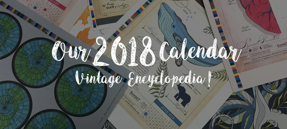
Our 2018 Calendar is Now Available!

2018 calendar

It’s that time of year… The temperatures dropping, hot coco sounds amazing, and our presses are working around the clock so you can ring in the new year with our 2018 Calendar!

This Year’s Theme:

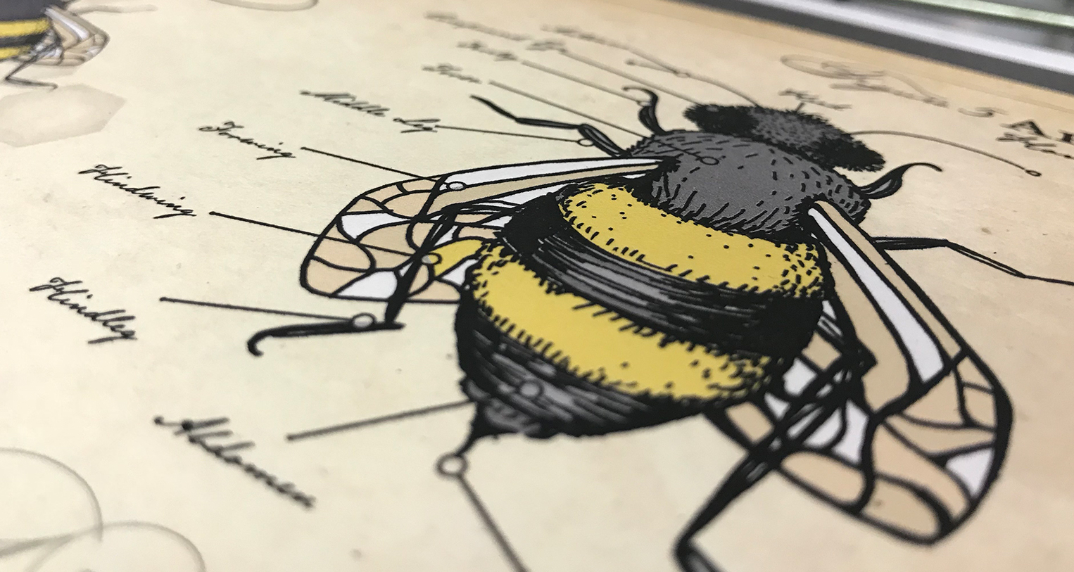
Vintage Encyclopedia!

If you have ever attended a Mohawk Event at Sunset or stopped by for a press proof, you can see and experience the dedication to craftsmanship that we have at Sunset.  Our aim is to meet the quality standards that past generations of pressman have set before us.

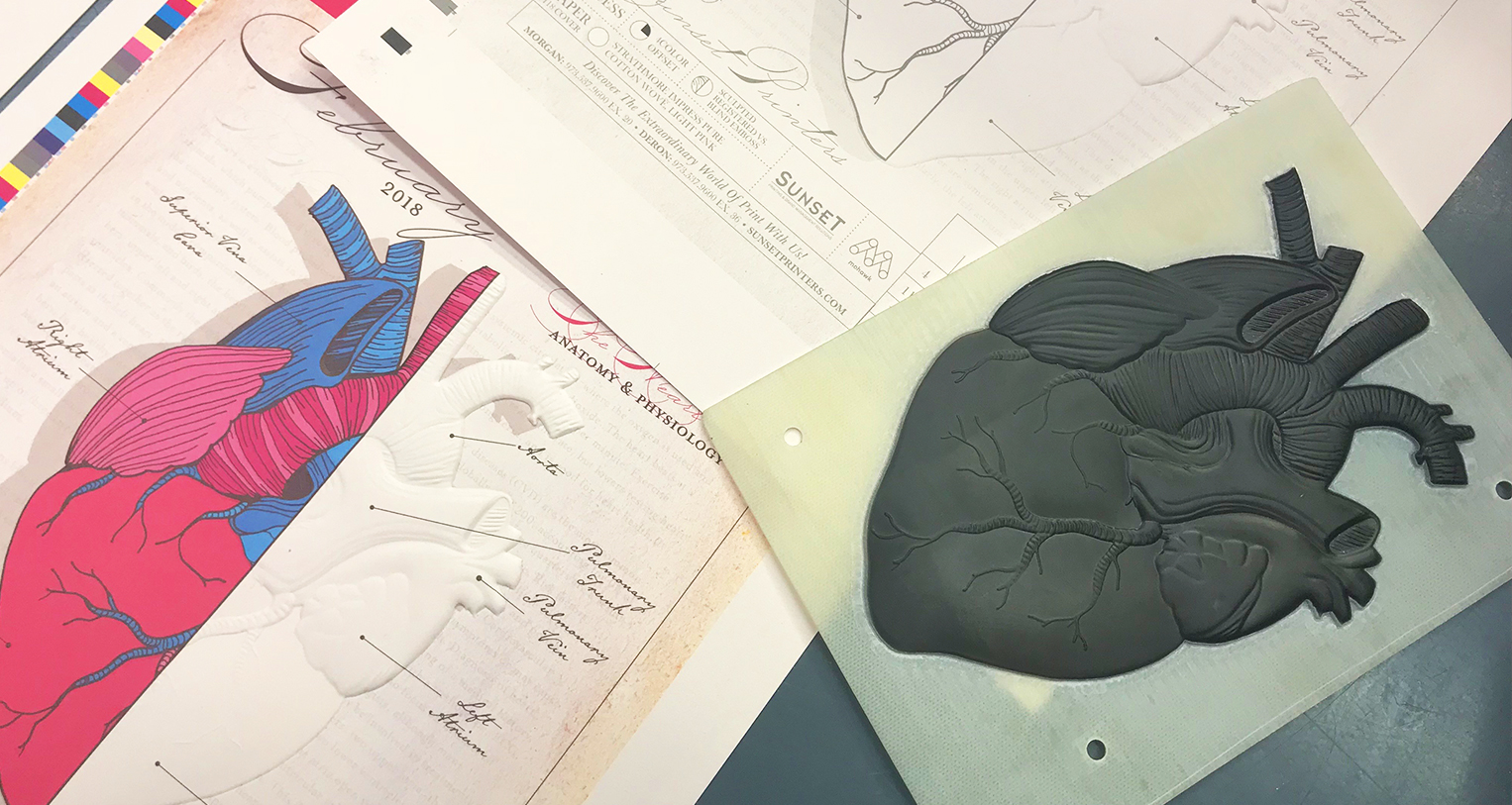
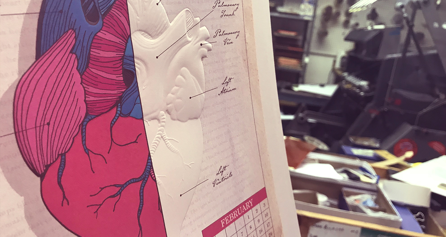
Our team of craftsmen and women have worked hard all year, designing, planning and producing our 2018 calendar to showcase the many ways that we make print exciting.  In an age where everything is expected to be faster, better, cheaper, we are making things slower, better and beautiful…by hand and by heart.

And so we thought…What better way to honor the history of printmaking and the effort that went into it, then making this year’s theme a vintage encyclopedia? Our 2018 theme was set!

Paper to Match:

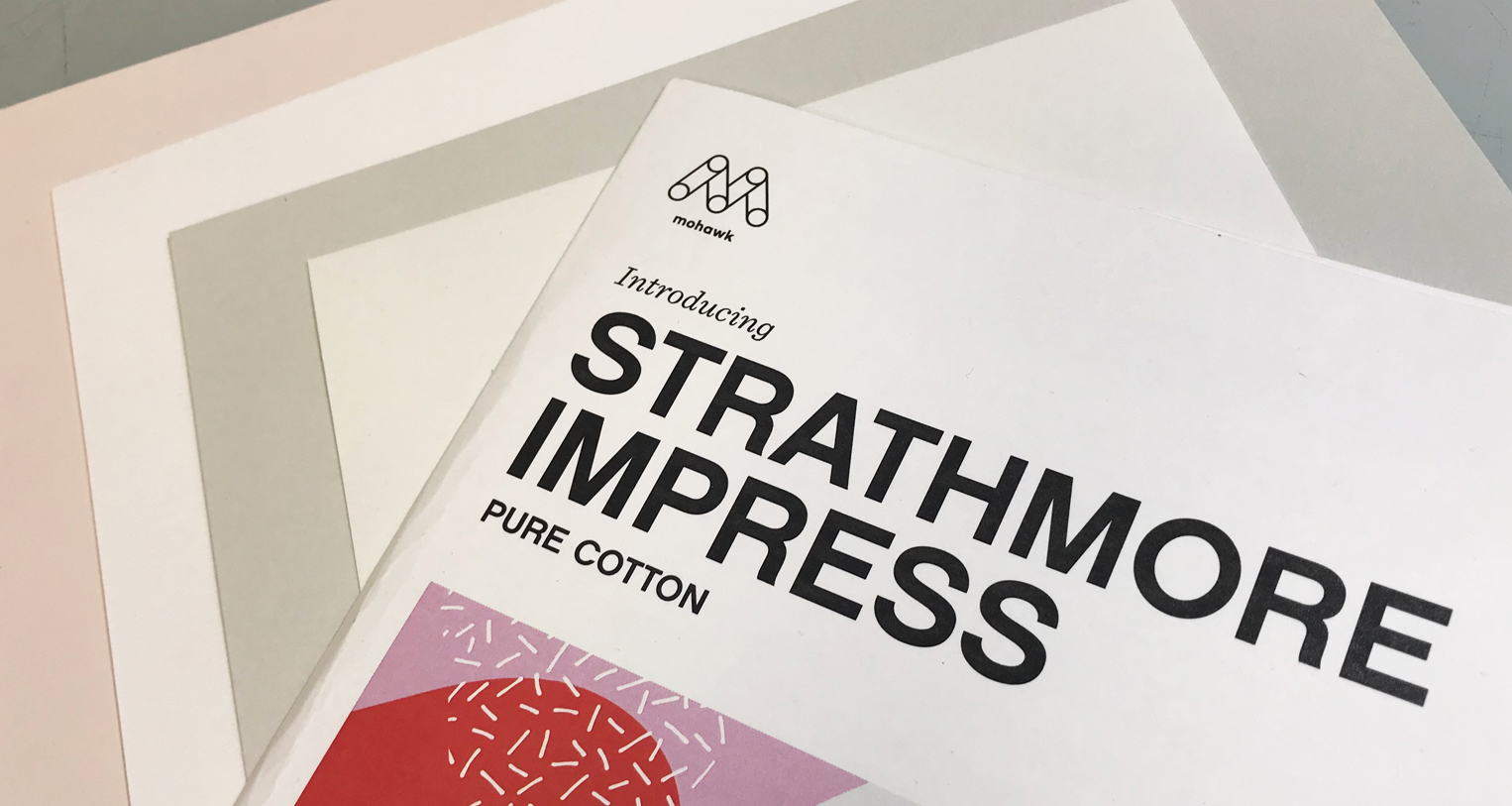
Mohawk Strathmore Impress Line in Soft White, Ultimate White, Light Pink and Light Gray
strathmore impress

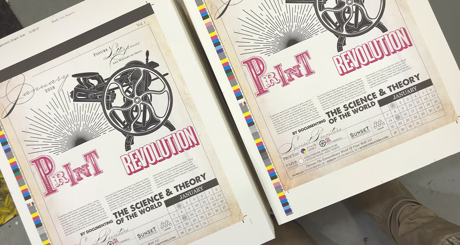
The paper we used was a perfect match for this year’s theme. We used Mohawk’s brand new Strathmore Impress Pure Cotton Wove Line in a mix of different colors to help give the book a more vintage feel. We used mostly “soft white” that naturally gave our design an aged feeling and ultimate white which made those white details pop!
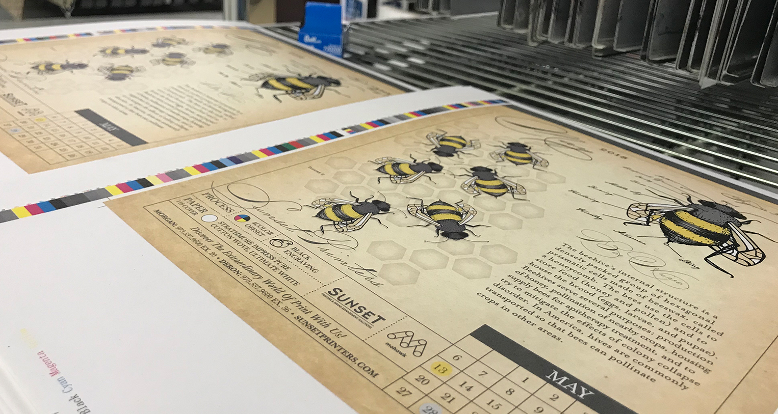
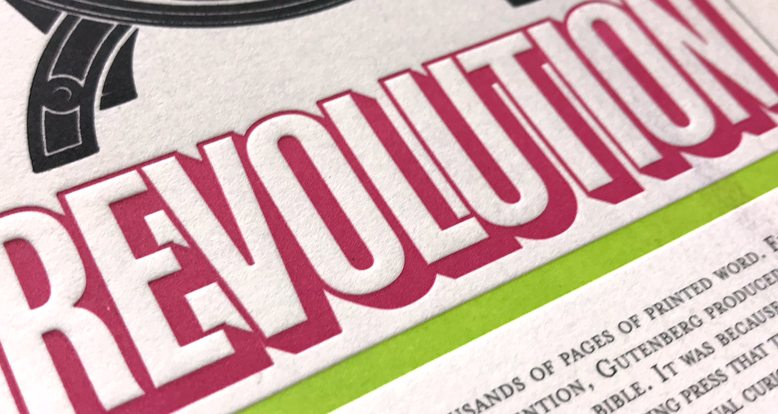
What we loved about this year’s paper choice, is that it printed offset beautifully as well as creating an in-depth impression on our letterpress and some of our sculpted emboss pieces. It truly held its own on the press and each color of paper complimented the print in its own way.
The Inside Scoop:

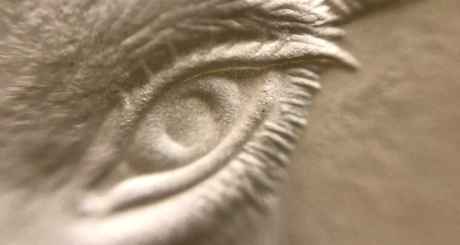
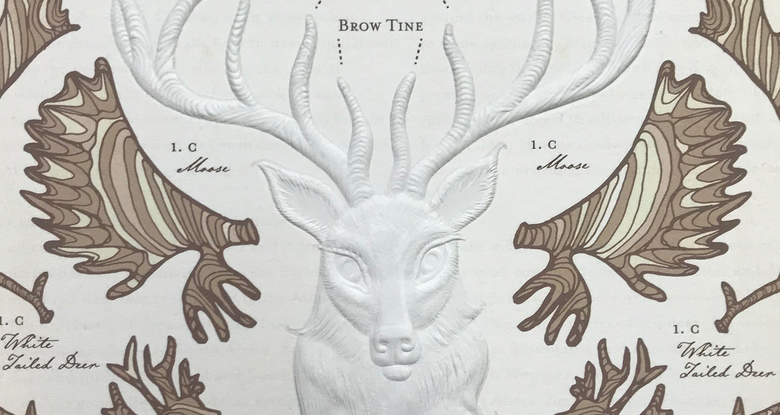
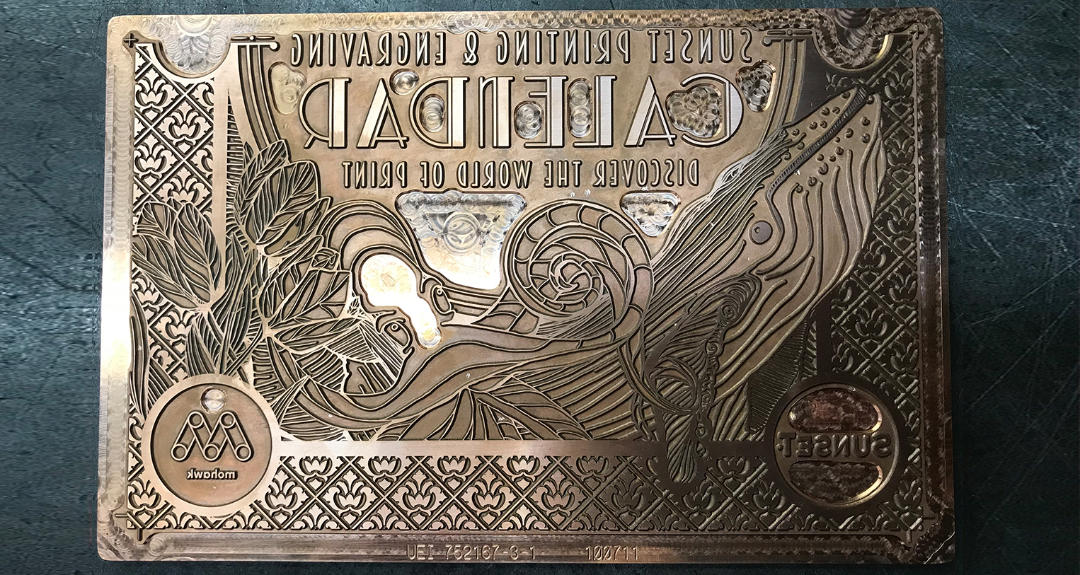
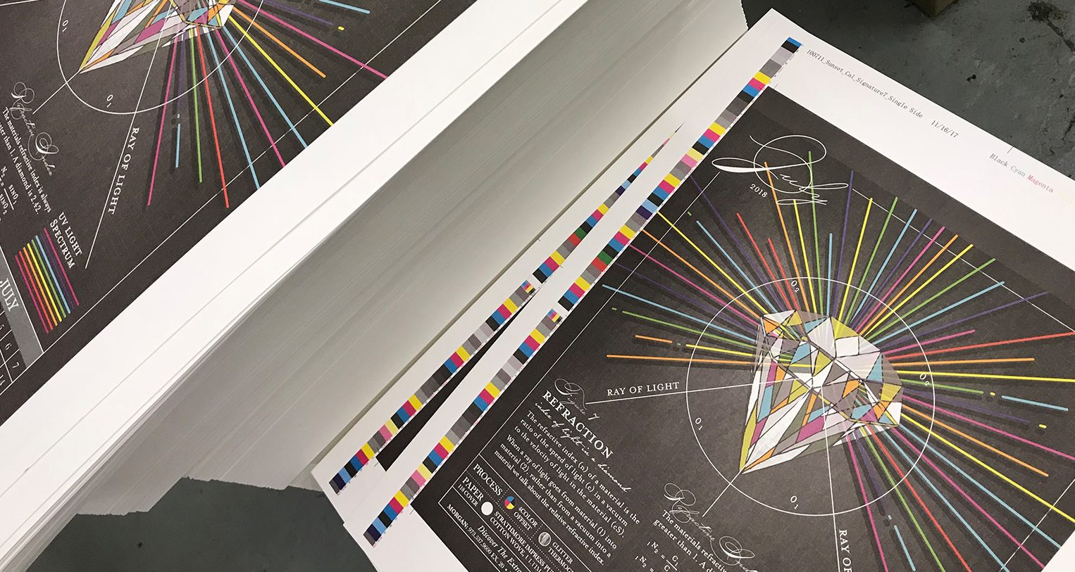
This year we have an embossed deer that has been sculpted by hand, a two-pass split fountain letterpress print, the earth revolving on its axis, some dragonfly wings that will leave you mesmerized and a giant blue whale diving right into the page! We could tell you everything but it’s better if you see it for yourself.

Don’t Miss Out! Be Sure to Pre-Order Free Today!
And come with us to discover the extraordinary world of print.